Communication plays a central role in both user interface (UI) and user experience (UX) design and understanding how your users perceive and interpret your work is key. The Gestalt Principles can help you do so.
Developed by Gestalt psychologists, the Gestalt Principles describe how we interpret and process complex stimuli around us. They state that our minds have a tendency to group and organize elements and do so in predictable ways. The ways in which our mind does so are summarized in the Gestalt Principles.
Great designers recognize how much impact psychology can have in visual perception. By applying Gestalt principles, a designer can improve the clarity of the product since visual interfaces function based on associations between graphical elements.
In this guide, we will introduce you to the five Gestalt Principles and how they contribute to user-friendly design.
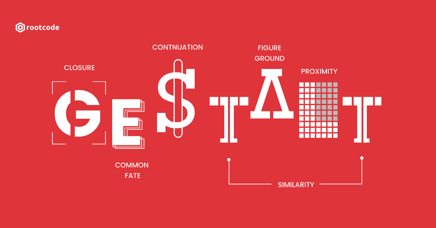
Introduction to the 5 Gestalt principles
If you’re here, chances are that you’re working to build a career in tech. Whether you’re an aspiring UX designer or a budding UI professional, the Gestalt Principles can help you to understand how the end user will interpret and navigate your work. Now let’s explore each of these principles in detail. The 5 Gestalt Principles we’ll take a look at are:
Proximity
Similarity
Continuity
Closure
Figure/ ground
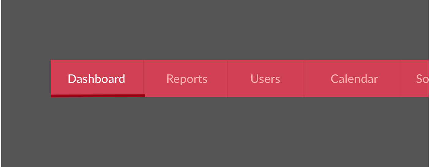
Proximity
The principle of proximity states that we tend to perceive elements as a group when they are close to each other. This can be used for grouping similar elements, organizing content, and decluttering layouts. You can find this principle applied in many places such as navigation panels, banners, galleries, body text, and pagination.

In the example above you’ll find that closer that items are they form a relationship. In turn, they are easier to read and associate with each other.
To better understand this principle further, we can use a check-out form as an example.
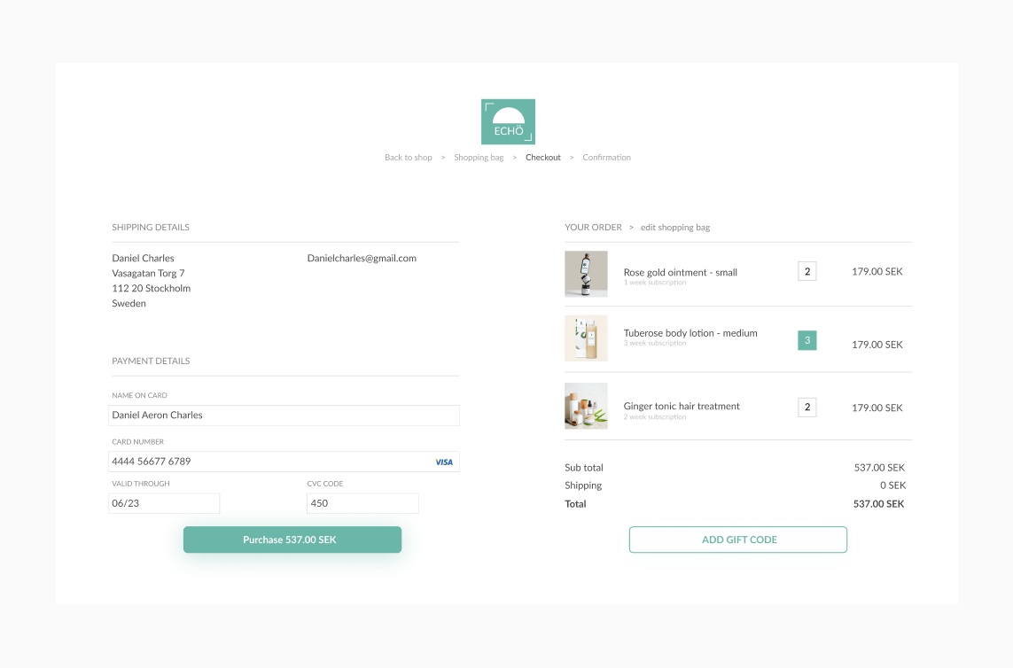
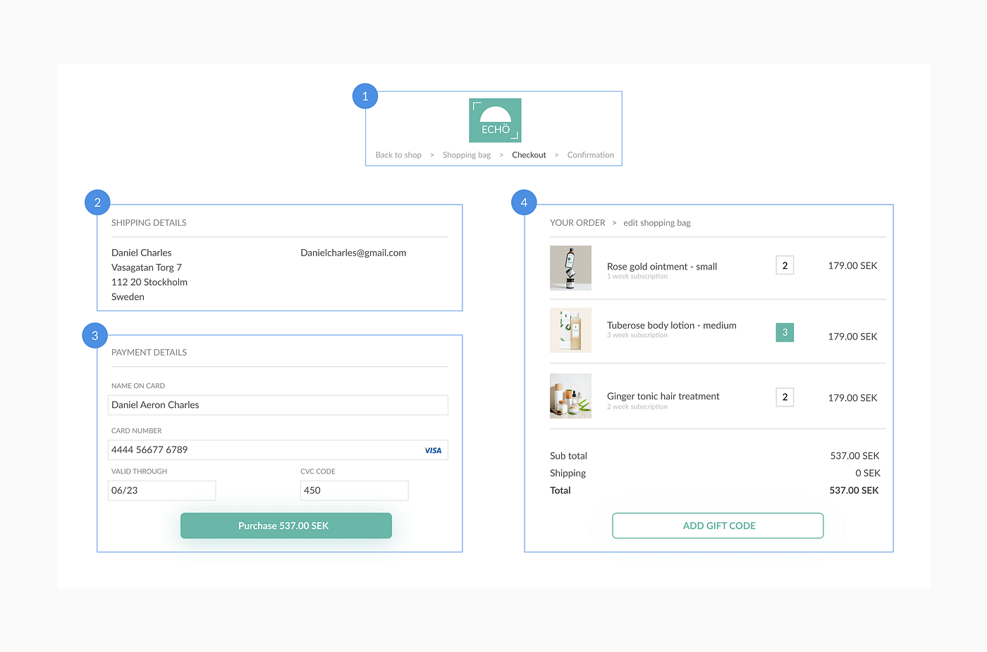
These groups don’t sit inside boxes or have clearly delineated borders around them. Yet we perceive them as separate clusters of content. We do so because the elements in each section sit close to each other.
If you look a little closer, you’ll notice subgroups in each group. In group 3, each input field and label are perceived as a separate group. In group 4, each list item is perceived as another. This is the principle of proximity in action.
Similarity
Throw a bag of M&Ms on a table and your mind will immediately start to group them by color. Red will be one group, green another, and yellow a third. We’re inclined to group elements that look like each other in terms of color, shape, or iconography.
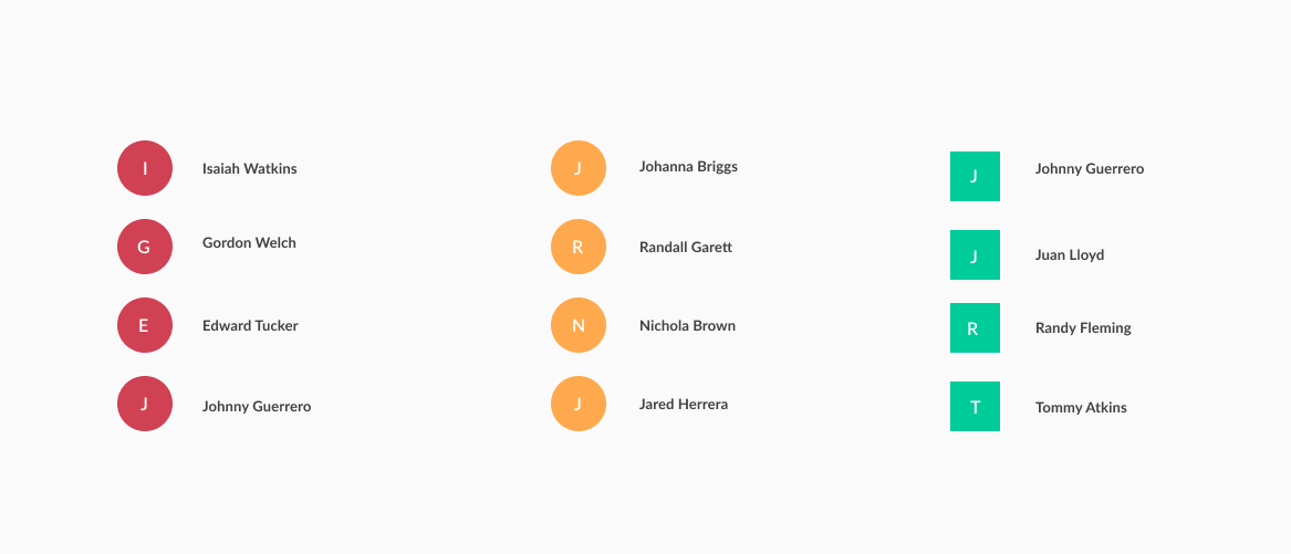
Visual nomenclature can help identify items that belong to similar or different categories while maintaining a consistent patterns across experiences.
Continuity
Ever notice how your eyes like to travel along lines, following and flowing with them? Our mind has a tendency to follow paths and group elements that are aligned with each other. The linear arrangement of rows and columns are good examples of continuity. As shown below they can be used in menus and sub-menus, lists, product arrangements, carousels, services, or process/progress displays. This is the principle of continuity.
In the example above it shows that This principle can be augmented by providing small visual clues (e.g. underlines) to indicate that the path of navigation path continues to a next level.
Closure
Individuals perceive objects such as shapes, letters, pictures, etc., as being whole when they are not complete. Specifically, when parts of a whole picture are missing, our perception fills in the visual gap. Since a whole is easier to process than multiple parts, we’ll fill in the gaps or connect the dots to complete implied shapes or images.
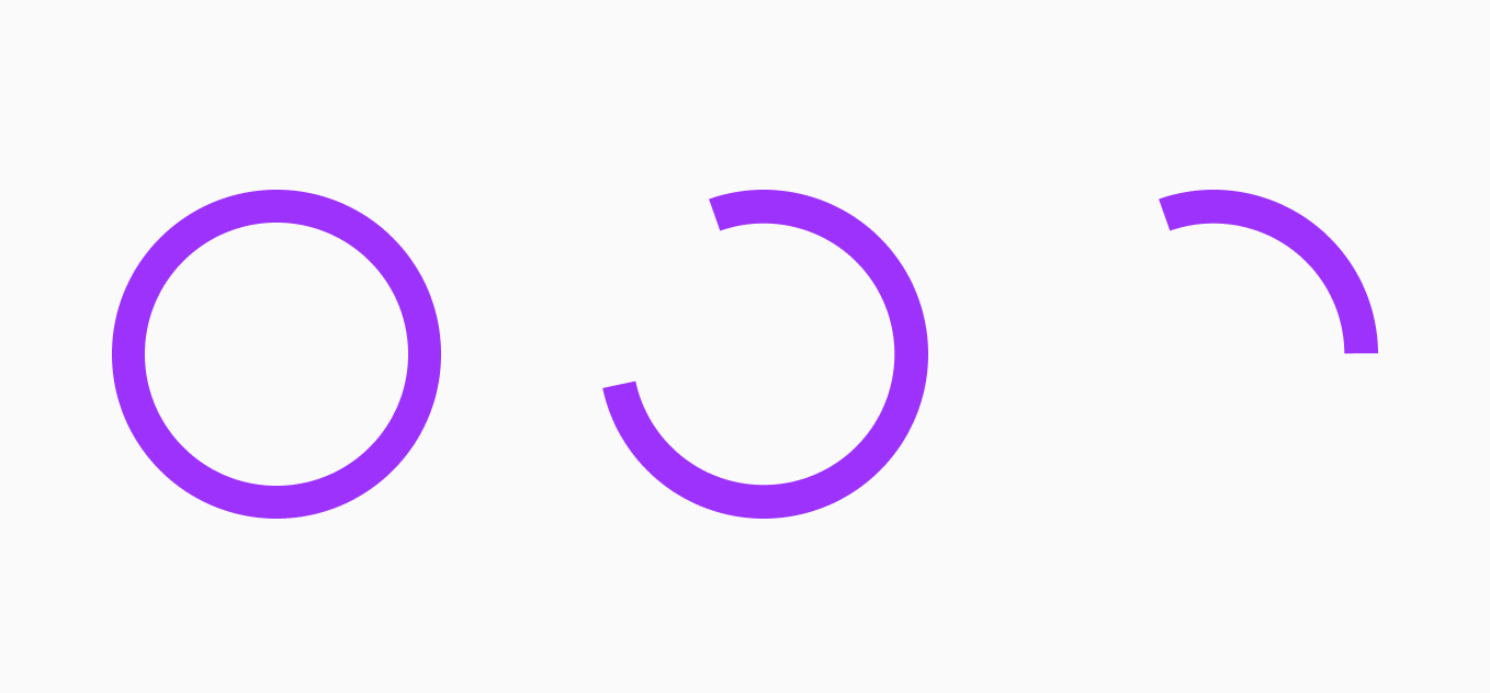
Loaders are a common element in user interfaces today. Whenever a product needs a little more time to complete a task, like refreshing or processing a payment, loaders will let us know the product is still working in the background.
Figure/ ground
The human brain often interprets ambiguous objects in more than one way, by bouncing back and forth between the alternatives seeking certainty. As a result, one view will become more dominant while the other one will get harder to see. Based on what our brain sees as the foreground and background this judgment can differ according to this principle; the figure talks about the focus of any composition, and the ground is the supporting background.

Hence, This principle refers to our ability to visually separate elements on different planes of focus. There are three ways to effectively execute this, of these through layering, contrast, and information hierarchy.
Wrapping up
These principles should be a mainstay in your toolbox. If applied correctly, they can provide you with some quick wins out of the box. Sometimes we’re using these principles without even knowing it — and that’s because we’re following what our minds tell us is logical.
Once you’ve got a solid grasp on them, it is easy to see the Gestalt Principles everywhere you look in UI and UX design. The next time you pop open your favorite app or find yourself enjoying a website, ask yourself: are any of the Gestalt Principles being applied here? Do they work alone or are they being used in combination? To help train your brain, make it a point to analyze every great app you come across, make notes and draw inspiration from it!